“The Last Of Us” Breaking News
- by Edwin K Brown
- Posted on 2022-06-15
The Last Of Us Remake Is Extremely Detailed, But Does It Matter? A new Digital Foundry video breakdown answers one question but raises another
For their latest trick, the pixel-analyzing masters at Digital Foundry picked a hot-button item: The Last of Us Part I. Though the question at the core of Part I—does this need to exist?—is still very much in play, you can’t deny a glow-up when you see one.
Announced last week at the Summer Game Fest kickoff event, The Last of Us Part I is a total remake of Naughty Dog’s seminal third-person survival game, first released in 2013 for the PlayStation 3 and again in 2014 with a remastered edition on PlayStation 4. Part I is meant to burnish the visuals of the original and bring its gameplay to modern parity with The Last of Us Part II, released in 2020 for the PlayStation 4.
The announcement set off a debate on social media, to the point where “the last of us” started trending on Twitter. Some observers said it barely looked any better than the original. Others seemed blown away to the moon and back over the ostensible improvements. As with all such arguments condensed into byte-sized bickering, people selectively chose screenshots that reinforced their specific points.
It’s impossible to assess whether or not The Last of Us is any fun with 2020-era Naughty Dog controls until the game comes out in September for PlayStation 5. (A PC release is coming down the line.) But you can get Digital Foundry, known for best-in-class breakdowns of visual quality, to speak to the graphics. They went deeeep.
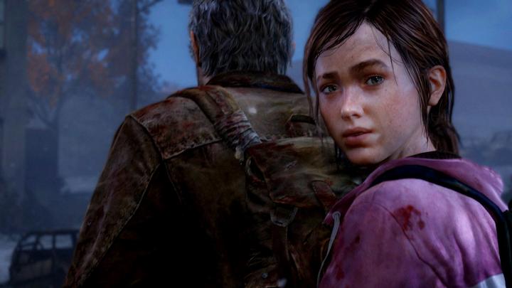
The big takeaway is clear: Based on publicly available footage, The Last of Us Part I is unambiguously more beautiful than the original(s). It’s especially noticeable in the foliage, which looks more lush and full, as if it signed up for a plant’s version of Hims. Facial textures are head and shoulders above the original and remastered versions—this is especially notable with details as granular as the creases around Joel’s mouth—and the lip sync is actually in tune with vocal tracks now. At one point, Digital Foundry even points out how Ellie’s eyes move mechanically in a cutscene from the original. But in the remake, according to trailer footage, Ellie’s eyes are more natural, moving to various focal points on less of a linear basis. (This is where in-the-weeds visual comparisons start to lose me a bit. The original eyes look totally fine to me!)
Digital Foundry also compared footage to see how Part I stacks up visually to Part II. Short version: There’s very little daylight between the two, something that’s most apparent when you look at the environments. “If I presented these shots without labels, you might assume they’re from the same game,” Digital Foundry’s Oliver Mackenzie said over footage of two similar landscape screenshots situated next to each other. The same point stands for the character models (which is also why Joel in Part I looks older than he did in the 2013 original, to be more in line with his age in Part II).
It’s an impressive rundown. And, of course, Naughty Dog—infamous for a studio-wide culture of perfectionism and for some reported instances of long hours as a result—is showcasing visuals that set a gold standard for the industry. But I’m nonetheless skeptical about the merits of this remake, and will reserve judgment until I actually play it. As the Twitter user KazHiraiCEO—a famous spoof account that aped former Sony boss Kaz Hirai—joked in 2015, “Announcing The Last of Us Remastered: Remastered for PS4. Joel’s beard will have 5% more detail than in the first Remastered version.”
The Last Of Us Remake Is Extremely Detailed, But Does It Matter? A new Digital Foundry video breakdown answers one question but raises another For their latest trick, the pixel-analyzing masters at Digital Foundry picked a hot-button item: The Last of Us Part I. Though the question at the core of Part I—does this need to exist?—is still very much in play,…